Type 1 Diabetes patients and clinicians need early warning of dangerous blood-sugar drops (hypoglycemia), explainable risk predictions they can trust, and data systems that plug into existing electronic health records.
Built a validated data pipeline for continuous glucose monitor (CGM) data, engineered ADA-aligned clinical features, trained a hypoglycemia risk model, added SHAP explainability and a retrieval-augmented (RAG) clinical chatbot over ADA guidelines, and exposed a FHIR R4 export layer for EHR interoperability.
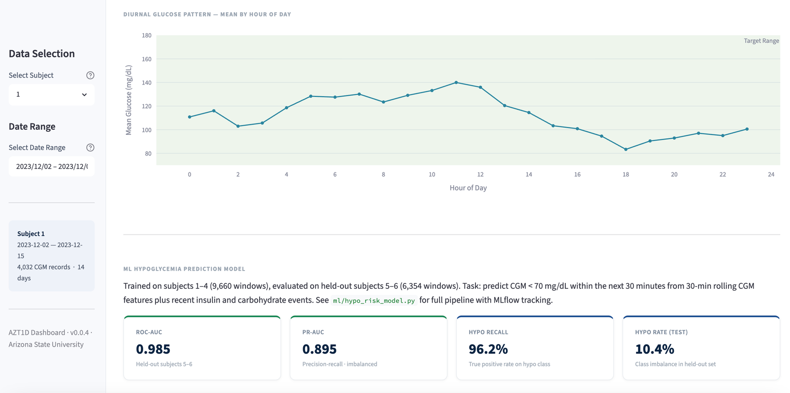
Achieved 0.985 AUC on held-out patients, backed by a 49-test validated data pipeline where real patient data is never committed to version control.
Demonstrates explainable clinical ML (SHAP), healthcare data interoperability (FHIR R4), and production-grade data validation — the combination clinical ML and health-tech teams look for when hiring for patient-facing risk models.
Interactive Dashboard
View Streamlit version ↗How to use this dashboard
- Select a patient from the dropdown above to load their CGM data across all tabs.
- Glucose Visualization shows 14 days of continuous glucose readings with color-coded zones (green = target range, red = hypoglycemia, yellow = hyperglycemia).
- Clinical Metrics displays ADA-aligned summary statistics for the selected patient.
- Risk Analysis shows the hypoglycemia risk model performance (ROC curve), which clinical features drive predictions (SHAP importance), and how the patient tracks against ADA goals.
- Counterfactual lets you adjust insulin sensitivity, carb ratio, and TIR target with sliders to model "what if" glucose scenarios in real time.
ROC Curve (AUC = 0.985)
Feature Importance (SHAP)
ADA Goal Attainment
Adjust parameters to model "what if" glycemic scenarios. Charts update in real time.
Note: dashboard uses synthetic CGM data. Real patient data is DVC-tracked and never committed to version control.
Project Highlights
- Hypoglycemia risk model: AUC 0.985 on held-out subjects using clinical CGM features
- SHAP beeswarm and importance plots for full model explainability across patient cohort
- RAG clinical chatbot over ADA guidelines, providing retrieval-augmented generation with context-aware answers
- FHIR R4 interoperability layer for EHR-compatible data export
- ADA-aligned clinical feature engineering: TIR, GMI, CV%, hypoglycemia/hyperglycemia episodes
- Counterfactual parameter adjustment tab for "what if" glycemic scenario modeling
- 49-test validated data pipeline with DVC versioning; real patient data never committed
- MLflow experiment tracking across model variants; SAS analytics companion; Tableau dashboard
- ASU team project. Primary contributor: data pipeline, feature engineering, test suite, all ML/AI modules
Dashboard Tabs
Tech Stack
Domain Tags
Data Privacy
Infographics
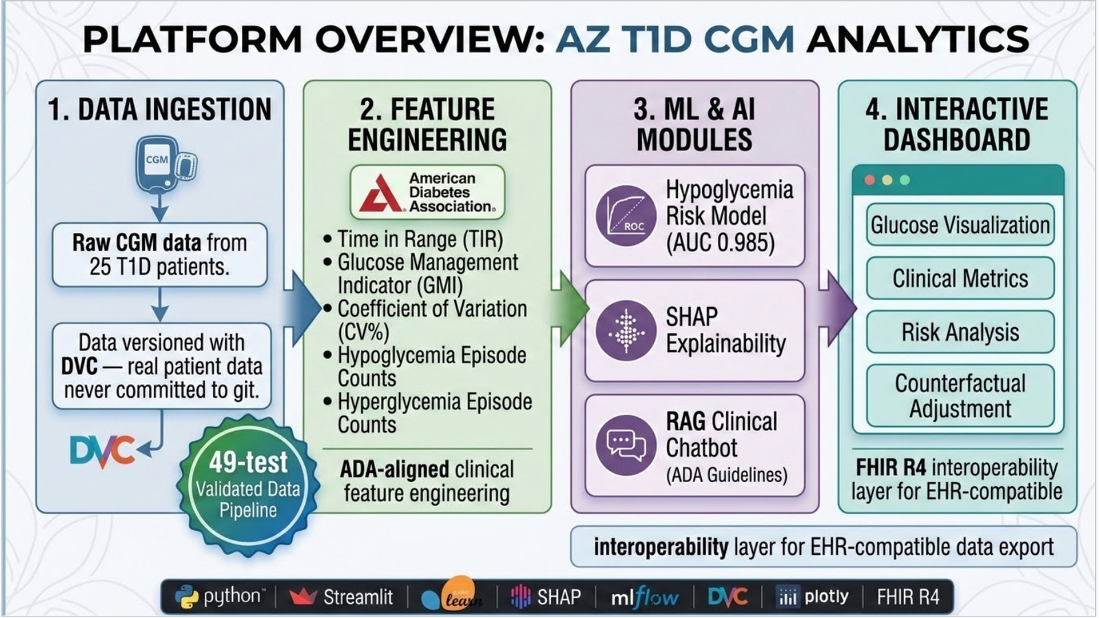
Platform overview: ingestion through interactive dashboard
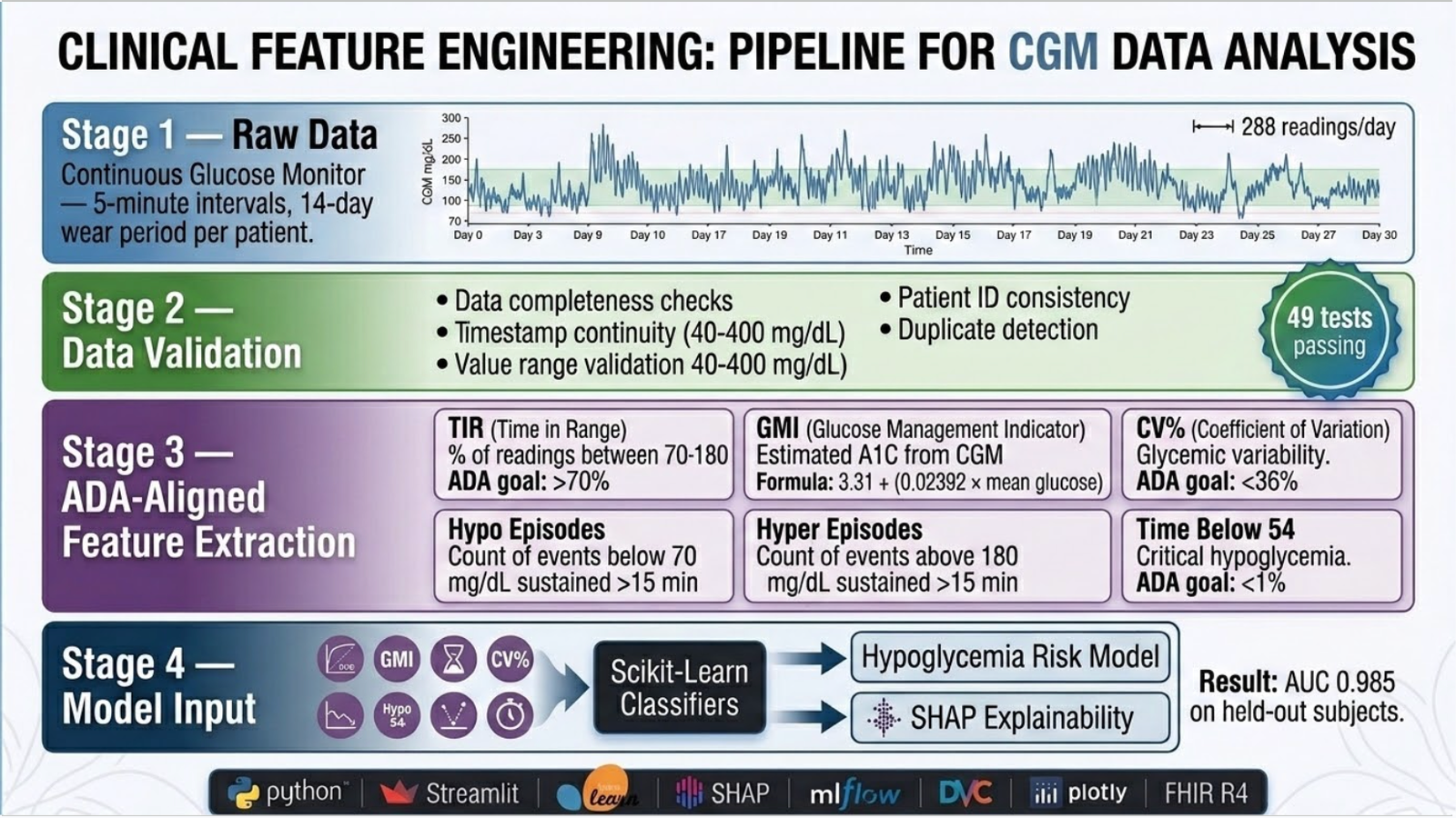
Clinical feature engineering pipeline for CGM data
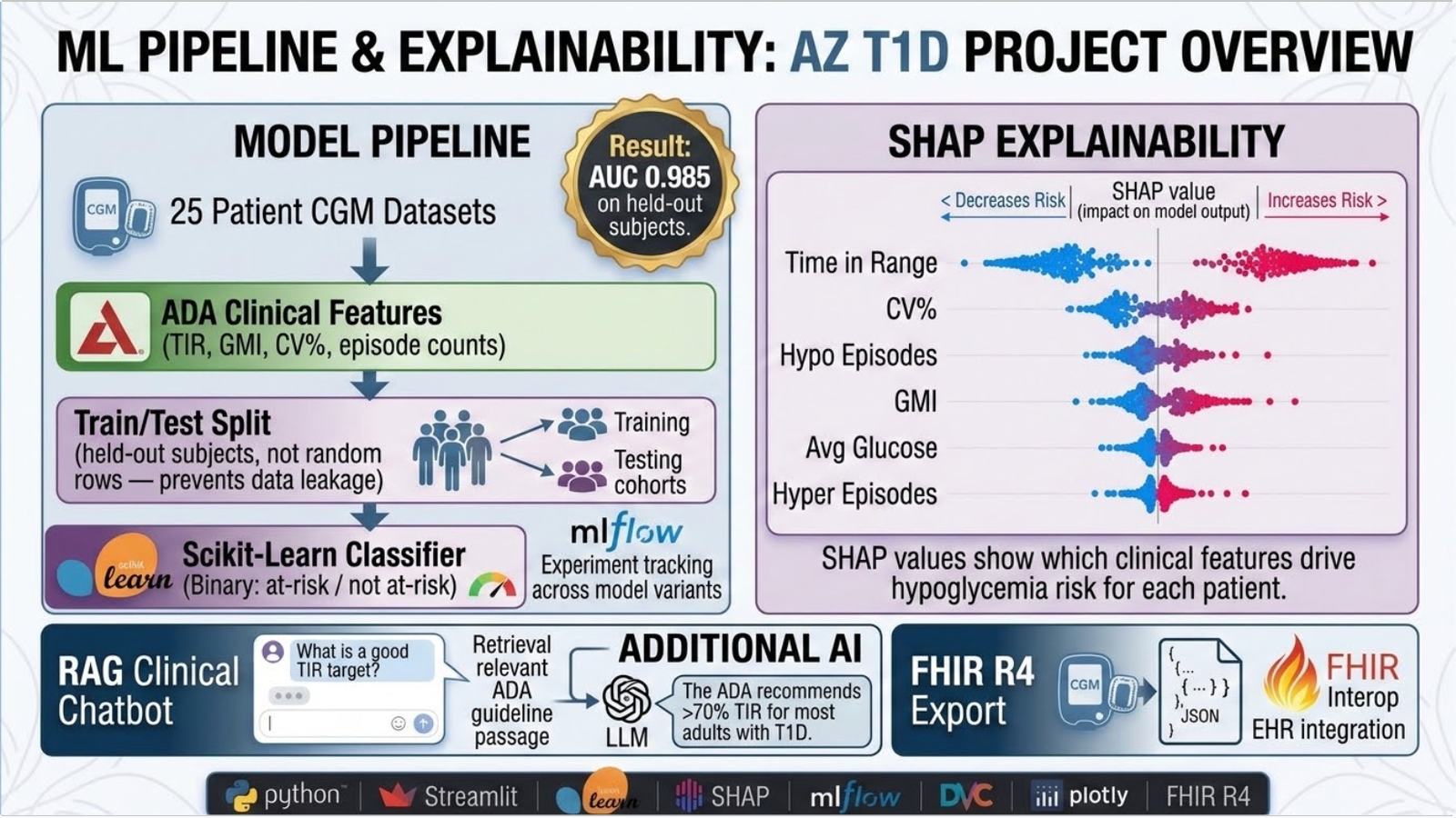
ML pipeline and SHAP explainability system
Screenshots
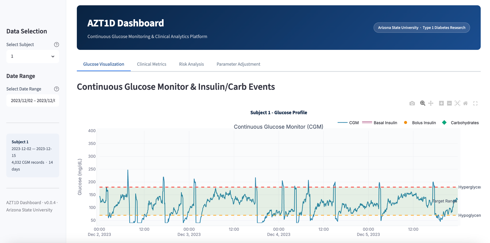
Glucose visualization tab: interactive CGM time-series with insulin and carb overlays
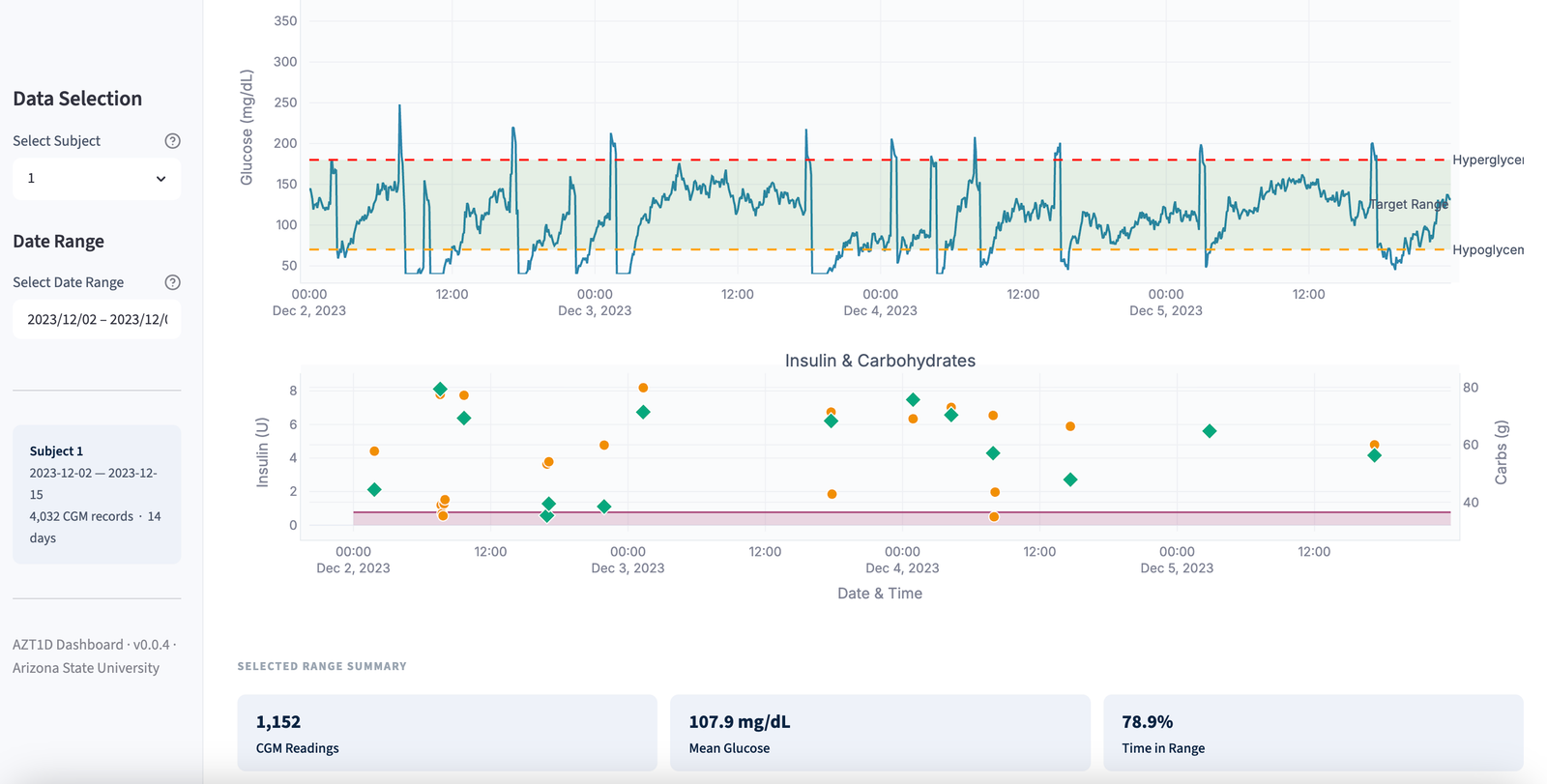
Glucose visualization tab: multi-patient comparison view
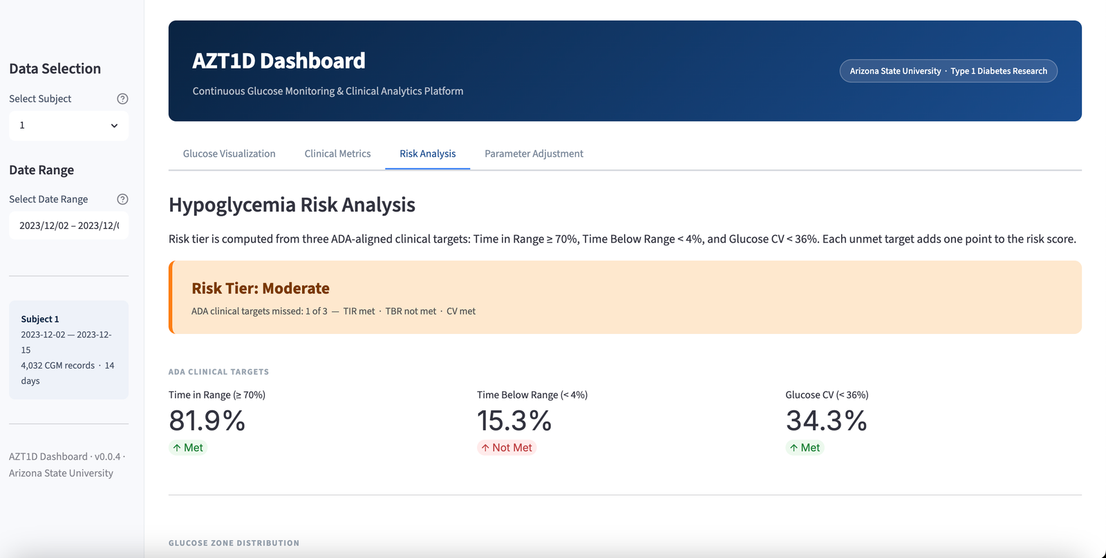
Risk analysis tab: ADA goal attainment and ML results (AUC 0.985)
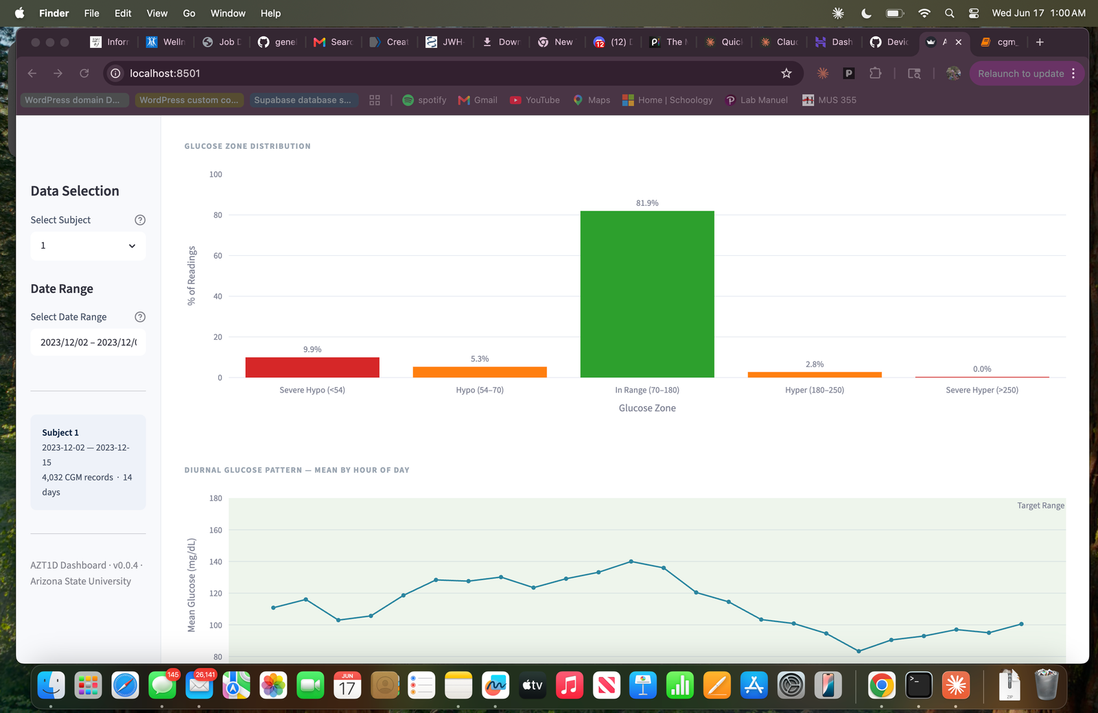
Clinical metrics tab: TIR, GMI, CV% and episode counts
Counterfactual adjustment tab
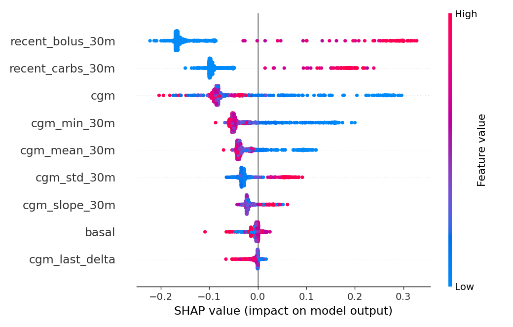
SHAP beeswarm: feature contributions to hypoglycemia risk
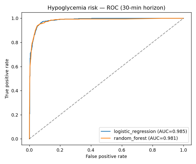
ROC curve (AUC 0.985 on held-out subjects)
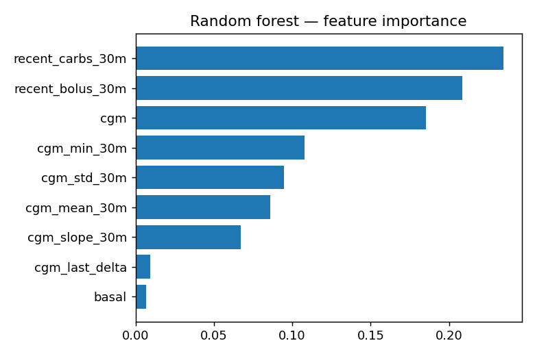
Feature importance ranking